
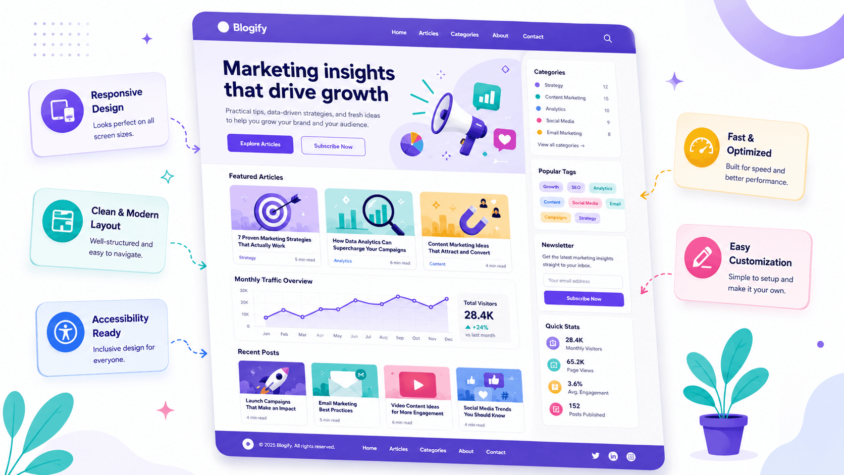
Marketing Blog Template – Responsive Homepage with Featured Posts, Stats, and Newsletter SidebarNew
• Updated 5/22/2026 • marketingblogbootstrap5responsivechartjsfrontendtemplate
Template Overview
This responsive marketing blog template is designed for content-driven websites that need a clean homepage layout. It includes a bold hero section, featured article highlights, a monthly traffic chart, recent blog post cards, a sidebar with categories and tags, and a newsletter signup form.
The template is beginner-friendly, iframe-preview friendly, and built with practical HTML, CSS, and JavaScript. It avoids unsafe external assets and uses accessible markup for navigation, forms, cards, and charts.
Best Use Cases
- Marketing blogs that publish growth, SEO, analytics, and conversion content.
- Agency websites that need a blog landing page for case studies and insights.
- Startup content hubs that promote resources, newsletters, and featured articles.
- Beginner frontend practice projects focused on responsive layouts.
Layout Sections
- Header Navigation – A responsive navbar with brand, menu links, and a call-to-action button.
- Hero Section – A strong headline, supporting text, and two CTA buttons.
- Featured Articles – Three highlighted posts in a responsive card grid.
- Traffic Chart – A canvas-based chart area powered by Chart.js when available, with a fallback message.
- Recent Posts Grid – Blog cards with categories, titles, summaries, and reading times.
- Sidebar – Categories, popular tags, newsletter signup, and quick stats.
- Footer – Simple footer with quick links and copyright text.
Responsive Behavior
- The navigation stacks neatly on small screens.
- The hero section uses a flexible two-column layout that becomes one column on mobile.
- Featured posts and recent posts automatically reflow using responsive grid styles.
- The sidebar moves below the post grid on smaller screens.
- The chart container keeps a stable height so it works well inside iframe previews.
How to Customize
- Edit the brand name inside
.brandintemplate_html. - Change the main colors by updating the CSS variables in
:root. - Replace the article titles, summaries, categories, and reading times with your own content.
- Update the chart labels and visitor numbers in
template_js. - Connect the newsletter form to your backend or email service when using it in production.
Code Preview
The template uses semantic HTML sections and accessible labels. A simplified structure looks like this:
<div class="marketing-blog">
  <header class="site-header">...</header>
  <main>
    <section class="hero">...</section>
    <section class="featured-section">...</section>
    <section class="content-section">...</section>
  </main>
  <footer class="site-footer">...</footer>
</div>
Implementation Notes
- The template is self-contained and does not require image URLs.
- Chart.js is used only if a global
Chartobject is already available in the preview environment. - If Chart.js is unavailable, the chart area shows a clean fallback message instead of breaking.
- The newsletter form is safely handled with JavaScript and does not submit data externally.
Accessibility Checklist
- Semantic landmarks such as
<header>,<main>,<section>,<aside>, and<footer>are used. - Navigation includes an
aria-label. - Form inputs are connected to visible
<label>elements. - Buttons and links have clear text labels.
- The chart canvas includes
role="img"and anaria-label. - Focus states are preserved and enhanced for keyboard users.