Modular Blog UI Component SetNew
• Updated 5/22/2026 • blogbootstrapcomponentsresponsivefrontend
Template Overview
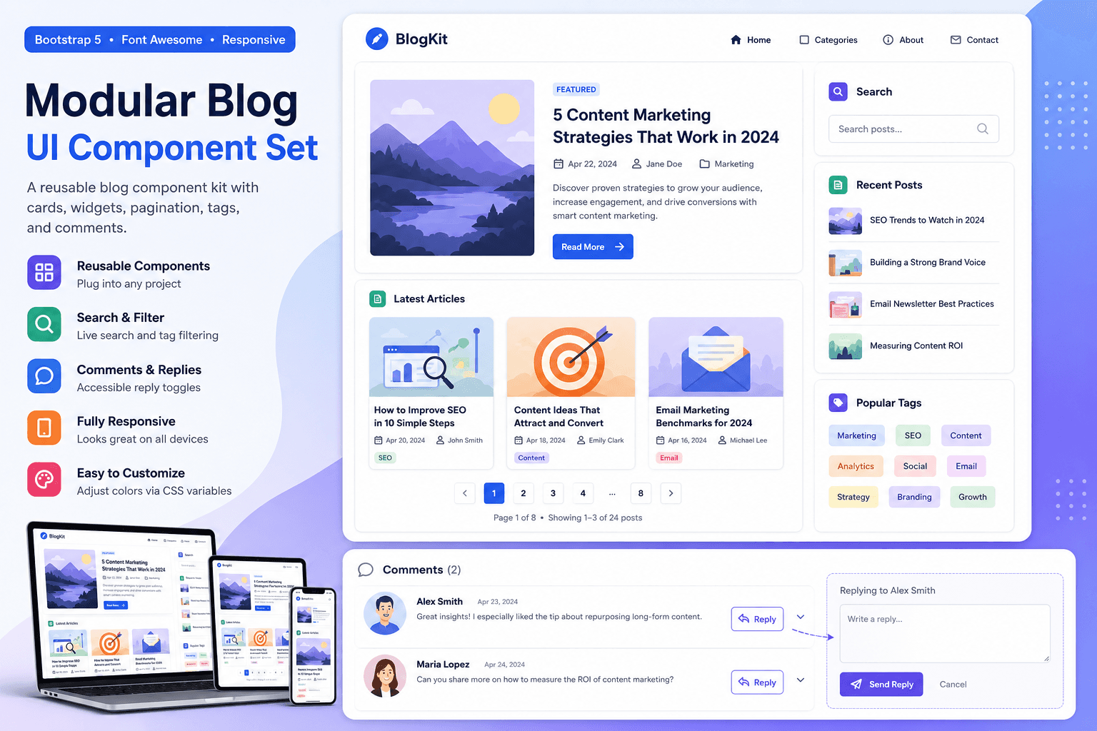
This demo web template provides a modular blog UI component set for building modern, responsive blog sections. It is a component kit, not a full landing page, so each block can be reused inside an existing website, dashboard, CMS theme, or content hub.
The kit includes a featured post card, reusable article cards, sidebar widgets, search input, tag cloud, pagination controls, and a comment list with reply boxes. The markup is semantic, accessible, beginner-friendly, and built to work well inside an iframe preview.
Best Use Cases
- Blog index pages that need reusable post card components.
- Marketing blogs, creator sites, and content hubs.
- Sidebar widget sections for search, recent posts, and tags.
- Article pages that need a clean comment list component.
- Bootstrap 5 practice projects focused on reusable UI sections.
Included Components
- Featured Post Card – A larger article preview with metadata and call-to-action button.
- Post Card Grid – Responsive cards for recent blog posts.
- Search Widget – A simple search input that filters visible demo cards by keyword.
- Recent Posts Widget – Compact sidebar list for quick navigation.
- Tag Cloud – Clickable tag buttons that filter visible posts.
- Pagination – Accessible pagination controls styled for blog listings.
- Comment List – Comment cards with accessible reply toggles.
Responsive Behavior
- The post cards use a responsive Bootstrap grid.
- The layout displays content and widgets side by side on larger screens.
- On smaller screens, all components stack into a single readable column.
- The featured post layout changes from horizontal to vertical on mobile.
- The tag cloud wraps naturally when there is limited space.
How to Customize
- Change component colors by editing CSS variables in
.blog-components-demo. - Replace article titles, excerpts, dates, and authors in
template_html. - Add more cards by duplicating a
.blog-post-itemblock. - Add more filter tags by duplicating a
.blog-tag-filterbutton. - Connect the search and pagination to your backend or CMS for production use.
Code Structure
The visible component markup is placed inside the document <body>. The main structure looks like this:
<section class="blog-components-demo">
  <div class="container">
    <div class="blog-kit-header">...</div>
    <div class="row">
      <main>...post components...</main>
      <aside>...sidebar widgets...</aside>
    </div>
  </div>
</section>
Implementation Notes
- This template uses Bootstrap 5-friendly classes and Font Awesome icons.
- No Chart.js, trackers, external scripts, unsafe forms, or broken image URLs are included.
- Visual thumbnails are created with CSS gradient blocks instead of external image assets.
- The JavaScript adds search filtering, tag filtering, reply toggles, and pagination status updates.
- All custom styles are scoped under
.blog-components-demo.
Accessibility Checklist
- Search input uses a visible
<label>. - Filter buttons use
aria-pressedto communicate active state. - Pagination is wrapped in a
<nav>with an accessible label. - Reply buttons use
aria-expandedandaria-controls. - Status messages use
aria-live="polite". - Keyboard focus states are visible for links, buttons, inputs, and textareas.